Cardinal John Foley Award

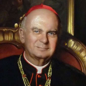
Cardinal John Patrick Foley was the patriarch of the American Catholic press for a reason. He understood long before most that the Gospel belongs on every platform available. From his early days as editor of Philadelphia’s archdiocesan newspaper and host of the Philadelphia Catholic Hour on radio to his global role as the English voice of the Christmas Midnight Mass, he spent his life helping the world see and understand the Church.

As president of the Pontifical Council for Social Communications, he didn't just maintain the status quo. He championed the Church's entry into the electronic news age and set a standard for every Catholic journalist who followed. His career proved that professional excellence and a pastoral heart are not mutually exclusive but are instead the essential tools of our trade.

Nomination Criteria

The Cardinal John P. Foley Award honors an individual who has demonstrated exceptional excellence and innovation in Catholic storytelling over the past year. This award recognizes those who find new and compelling ways to share the faith, moving beyond traditional reporting to reach people where they are.

To be eligible, a nominee must be a Catholic Media Association member or an employee or contributor to a CMA member organization. We are looking for work that showcases creativity across any medium, including:

  • Video and digital film
  • Podcasts and audio storytelling
  • Photojournalism and visual spreads
  • Blogs and digital commentary
  • Multimedia projects that blend platforms to reach a modern audience

Nomination period is open from Jan. 6 to March 6, 2026.

Cardinal John Foley Award Nomination Form (nomination period closed March 6)


Selection Procedure

Any CMA member can make a nomination or submission. Once the nominating period is closed, a committee of CMA board members ranks its top two choices. The candidate with the most first-place votes wins the award. In the event of a tie, the candidate who received the most second-place votes will win.


Most Recent Winners
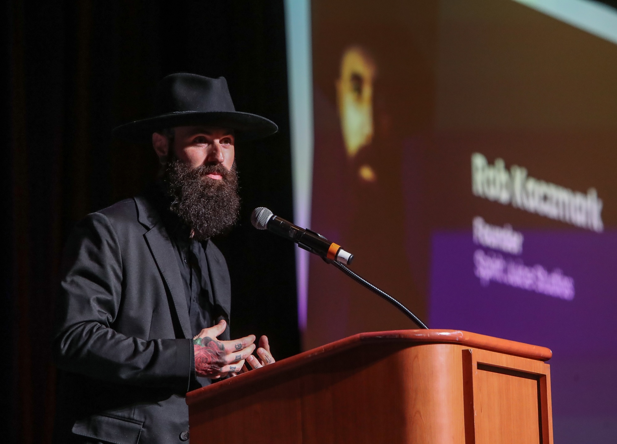
  • 2026: Rob Kaczmark, Spirit Juice Studios
  • 2025: Juan Guajardo, Diocese of Fort Worth and North Texas Catholic
  • 2024: Matt Riedl, Diocese of Lansing
  • 2023: Katie Rutter, Thing in a Pot Productions (Hundredfold Video)
  • 2022: Fr. Mike Schmitz & Jeff Cavins, Ascension
  • 2021: Peter Finney, Clarion Herald
  • 2020: Chaz Muth, Catholic News Service
/* ========================================================================== CMA NOVI SITE — COMBINED HEAD TAG CSS & STYLES This ONE field is shared across the ENTIRE Novi site (all microsites). It currently holds two sections: CMC 2027 (.cmc2027) and Gabriel Awards (.gabrielawards). Always paste this COMPLETE file back in, never a partial section, or the other microsite's styles will be lost. ========================================================================== */ @import url('https://fonts.googleapis.com/css2?family=Fraunces:ital,opsz,wght@0,9..144,400;0,9..144,500;0,9..144,600;0,9..144,700;1,9..144,500&family=Source+Sans+3:wght@400;500;600;700&display=swap'); /* ============================================================ SECTION 1 of 2 — CMC 2027 (unchanged, exactly as it was live) ============================================================ */ .post-extra-info a, .section-header .subtitle .post-extra-info a { color: #fff !important; text-decoration: underline;} body { background-color: white; } .hovernow { background-color: red; width: 100px; height: 100px; margin: 10px; box-shadow: 0 1px 2px rgba(0, 0, 0, 0.15); transition: box-shadow 0.3s ease-in-out; } .hovernow:hover { box-shadow: 0 5px 15px rgba(0, 0, 0, 0.8); } .product-detail-container .back-btn { color: #19405A; } .product-detail-container .back-btn:hover { color: #BFB297; } html body div.alert-bar div.container span.novicon.novicon-warning{ display:none} .body-content { overflow-x: hidden; } .cmc2027 { --sky-pale:#DCF0F9; --sky:#3FA9DC; --sky-deep:#1F7FB0; --sand:#EAD6AC; --sand-deep:#D9BD86; --terracotta:#8B4735; --terracotta-deep:#6E362A; --gold:#F0B93E; --amber:#D97F1E; --ink:#2B2827; --ink-soft:#5A5250; --paper:#FBF7EF; --line:#E3D6BE; } .cmc2027 * { box-sizing:border-box; } .cmc2027 { margin:0; font-family:"Source Sans 3", sans-serif; color:var(--ink); background:var(--paper); line-height:1.55; } .cmc2027 h1, .cmc2027 h2, .cmc2027 h3, .cmc2027 h4 { font-family:"Fraunces", serif; margin:0; color:var(--terracotta-deep); font-weight:600; } .cmc2027 p { margin:0 0 1em; } .cmc2027 a { color:inherit; } .cmc2027 .wrap { max-width:1080px;margin:0 auto;padding:0 28px; } .cmc2027 .script { font-family:"Caveat", cursive; font-size:1.5rem; color:var(--terracotta); font-weight:600; } .cmc2027 nav { position:sticky; top:0; z-index:20; background:rgba(251,247,239,0.92); backdrop-filter:blur(6px); border-bottom:1px solid var(--line); } .cmc2027 nav .wrap { display:flex; align-items:center; justify-content:space-between; height:68px; } .cmc2027 .brand { display:flex; align-items:center; gap:10px; font-family:"Fraunces",serif; font-weight:600; font-size:1.05rem; color:var(--terracotta-deep); white-space:nowrap; flex-shrink:0; } .cmc2027 .brand-logo { height:40px; width:40px; border-radius:50%; flex-shrink:0; box-shadow:0 2px 6px rgba(31,71,90,0.25); } .cmc2027 .nav-links { display:flex; align-items:center; gap:22px; font-size:0.95rem; flex-shrink:0; } .cmc2027 .nav-links a { text-decoration:none; color:var(--ink-soft); white-space:nowrap; } .cmc2027 .hamburger-btn { display:none; background:none; border:none; cursor:pointer; padding:8px; margin-left:8px; } .cmc2027 .hamburger-btn svg { width:26px; height:26px; display:block; } .cmc2027 .btn { display:inline-block; flex-shrink:0; padding:11px 22px; border-radius:5px; background:var(--terracotta); color:#fff !important; text-decoration:none; font-weight:600; font-size:0.95rem; border:none; cursor:pointer; transition:background .15s ease; } .cmc2027 .btn:hover { background:var(--terracotta-deep); } .cmc2027 .btn-ghost { background:transparent; color:var(--terracotta) !important; border:1.5px solid var(--terracotta); } .cmc2027 .btn-ghost:hover { background:var(--terracotta); color:#fff !important; } .cmc2027 .hero { position:relative; overflow:hidden; background:linear-gradient(180deg, var(--sky-pale) 0%, var(--sky) 62%, var(--sky-deep) 78%); padding:76px 0 0; } .cmc2027 .hero-inner { position:relative; z-index:2; text-align:center; padding-bottom:40px; } .cmc2027 .eyebrow { text-transform:none; color:var(--terracotta-deep); font-family:"Caveat", cursive; font-size:1.7rem; display:block; margin-bottom:2px; } .cmc2027 .hero h1 { font-size:clamp(2.1rem, 5vw, 3.4rem); line-height:1.08; color:var(--terracotta-deep); max-width:820px; margin:0 auto 18px; } .cmc2027 .hero-meta { font-size:1.15rem; color:#3a2f2a; font-weight:600; margin-bottom:26px; } .cmc2027 .hero-meta span { margin:0 10px; } .cmc2027 .hero-cta { display:flex; gap:14px; justify-content:center; flex-wrap:wrap; } .cmc2027 .hero-logo { width:190px; height:190px; border-radius:50%; box-shadow:0 14px 34px rgba(31,71,90,0.28); margin:0 auto 22px; display:block; } .cmc2027 .skyline { display:block; width:100%; height:auto; margin-top:30px; } .cmc2027 .photo-placeholder { background:var(--sand); border:1.5px dashed var(--sand-deep); border-radius:8px; display:flex; flex-direction:column; align-items:center; justify-content:center; gap:6px; color:var(--ink-soft); text-align:center; } .cmc2027 .photo-placeholder svg { width:28px; height:28px; opacity:0.55; } .cmc2027 .photo-placeholder span { font-size:0.78rem; font-style:italic; } .cmc2027 .testimonial-avatar { width:52px; height:52px; border-radius:50%; margin-bottom:14px; } .cmc2027 .testimonial-avatar svg { width:20px; height:20px; } .cmc2027 .wave-divider { line-height:0; margin:-1px 0; } .cmc2027 .wave-divider svg { display:block; width:100%; height:46px; } .cmc2027 .testimonials { background:var(--sky-pale); } .cmc2027 .pricing-band { background:var(--sand); } .cmc2027 section { padding:74px 0; } .cmc2027 .section-head { max-width:640px; margin:0 auto 44px; text-align:center; } .cmc2027 .section-head h2 { font-size:2rem; margin-bottom:10px; } .cmc2027 .section-head p { color:var(--ink-soft); margin:0; } .cmc2027 .about-grid { display:grid; grid-template-columns:1.1fr 0.9fr; gap:52px; align-items:start; } .cmc2027 .about-grid h2 { font-size:1.9rem; margin-bottom:16px; } .cmc2027 .about-grid p { color:var(--ink-soft); } .cmc2027 .fact-card { background:var(--sand); border-radius:8px; padding:28px; border:1px solid var(--sand-deep); } .cmc2027 .fact-row { display:flex; justify-content:space-between; gap:16px; padding:13px 0; border-bottom:1px solid var(--sand-deep); font-size:0.96rem; } .cmc2027 .fact-row:last-child { border-bottom:none; } .cmc2027 .fact-label { color:var(--terracotta-deep); font-weight:600; } .cmc2027 .fact-value { color:var(--ink); text-align:right; } .cmc2027 .awards { background:var(--sand); } .cmc2027 .video-frame-outer { max-width:900px; margin:0 auto; padding:8px; border-radius:24px; background:linear-gradient(135deg, var(--terracotta), var(--gold)); box-shadow:0 24px 48px rgba(43,40,39,0.25); } .cmc2027 .video-frame { border-radius:18px; overflow:hidden; aspect-ratio:16/9; position:relative; background:#000; } .cmc2027 .video-frame iframe { width:100%; height:100%; position:absolute; top:0; left:0; border:0; display:block; } .cmc2027 .tabs { display:flex; justify-content:center; gap:6px; margin-bottom:38px; flex-wrap:wrap; } .cmc2027 .tab-btn { font-family:"Source Sans 3", sans-serif; font-weight:600; font-size:0.95rem; padding:12px 20px; border-radius:6px 6px 0 0; border:none; background:transparent; color:var(--ink-soft); cursor:pointer; border-bottom:3px solid transparent; } .cmc2027 .tab-btn.active { color:var(--terracotta-deep); border-bottom:3px solid var(--terracotta); } .cmc2027 .day-panel { display:none; } .cmc2027 .day-panel.active { display:block; } .cmc2027 .timeline { max-width:760px; margin:0 auto; border-left:2px solid var(--sand-deep); padding-left:0; } .cmc2027 .event { display:grid; grid-template-columns:170px 1fr; gap:22px; padding:18px 0 18px 26px; position:relative; border-bottom:1px solid var(--line); } .cmc2027 .event:last-child { border-bottom:none; } .cmc2027 .event::before { content:""; position:absolute; left:-6px; top:26px; width:10px; height:10px; border-radius:50%; background:var(--terracotta); } .cmc2027 .event-time { font-weight:600; color:var(--terracotta-deep); font-size:0.92rem; padding-top:2px; } .cmc2027 .event-body h4 { font-size:1.05rem; margin-bottom:4px; color:var(--ink); } .cmc2027 .event-loc { color:var(--ink-soft); font-size:0.9rem; margin:0; } .cmc2027 .event-desc { color:var(--ink-soft); font-size:0.92rem; margin-top:6px; } .cmc2027 .tbd { color:#9c8f76; font-style:italic; } .cmc2027 .testimonials-row { display:flex; gap:22px; overflow-x:auto; scroll-snap-type:x mandatory; padding:6px 4px 18px; margin:0 -4px; } .cmc2027 .testimonial-card { scroll-snap-align:start; flex:0 0 300px; background:#fff; border:1px solid var(--line); border-radius:10px; padding:26px 24px; display:flex; flex-direction:column; } .cmc2027 .testimonial-quote { font-family:"Fraunces", serif; font-size:1.6rem; color:var(--terracotta); line-height:1; margin-bottom:6px; } .cmc2027 .testimonial-text { color:var(--ink); font-size:0.96rem; margin-bottom:18px; flex:1; } .cmc2027 .testimonial-name { font-weight:600; color:var(--terracotta-deep); font-size:0.94rem; } .cmc2027 .testimonial-role { color:var(--ink-soft); font-size:0.85rem; } .cmc2027 .testimonials-row::-webkit-scrollbar { height:6px; } .cmc2027 .testimonials-row::-webkit-scrollbar-thumb { background:var(--sand-deep); border-radius:3px; } .cmc2027 .pricing-grid { display:grid; grid-template-columns:repeat(3, 1fr); gap:24px; align-items:stretch; } .cmc2027 .price-card { background:#fff; border:1px solid var(--line); border-radius:10px; padding:30px 26px; display:flex; flex-direction:column; position:relative; } .cmc2027 .price-card.current { border:2px solid var(--terracotta); box-shadow:0 8px 24px rgba(139,71,53,0.12); } .cmc2027 .price-flag { position:absolute; top:-13px; left:26px; background:var(--terracotta); color:#fff; font-size:0.75rem; font-weight:600; padding:4px 12px; border-radius:20px; } .cmc2027 .price-card h3 { font-size:1.25rem; margin-bottom:4px; } .cmc2027 .price-window { color:var(--ink-soft); font-size:0.86rem; margin-bottom:22px; } .cmc2027 .price-window .tbd { color:var(--ink-soft); font-style:normal; } .cmc2027 .price-rows { border-top:1px solid var(--line); margin-top:auto; } .cmc2027 .price-row { display:flex; justify-content:space-between; align-items:baseline; padding:14px 0; border-bottom:1px solid var(--line); } .cmc2027 .price-row-label { font-size:0.92rem; color:var(--ink-soft); } .cmc2027 .price-row-value { font-family:"Fraunces", serif; font-size:1.4rem; color:var(--terracotta-deep); font-weight:600; } .cmc2027 .group-discount-note { max-width:700px; margin:32px auto 0; background:#fff; border:1.5px dashed var(--terracotta); border-radius:10px; padding:20px 26px; text-align:center; color:var(--ink); font-size:0.96rem; } .cmc2027 .group-discount-note strong { color:var(--terracotta-deep); } .cmc2027 .rate-subhead { max-width:640px; margin:56px auto 20px; text-align:center; } .cmc2027 .rate-subhead h3 { font-size:1.3rem; color:var(--terracotta); padding-bottom:10px; border-bottom:2px solid var(--line); } .cmc2027 .rate-grid { display:grid; grid-template-columns:repeat(4, 1fr); gap:16px; max-width:900px; margin:0 auto; } .cmc2027 .rate-item { background:#fff; border:1px solid var(--line); border-radius:8px; padding:18px 12px; text-align:center; } .cmc2027 .rate-label { display:block; font-size:0.85rem; color:var(--ink-soft); margin-bottom:4px; } .cmc2027 .rate-value { font-family:"Fraunces", serif; font-size:1.3rem; color:var(--terracotta-deep); font-weight:600; } .cmc2027 .info { background:linear-gradient(180deg, var(--sky-deep) 0%, var(--sky) 100%); color:#fff; } .cmc2027 .info h2 { color:#fff; } .cmc2027 .info .section-head p { color:#EAF6FD; } .cmc2027 .info-grid { display:grid; grid-template-columns:repeat(3, 1fr); gap:30px; text-align:center; } .cmc2027 .info-card h3 { color:#fff; font-size:1.1rem; margin-bottom:8px; } .cmc2027 .info-card p { color:#EAF6FD; font-size:0.92rem; margin:0; } .cmc2027 .closing { background:linear-gradient(180deg, var(--gold) 0%, var(--amber) 100%); text-align:center; } .cmc2027 .closing h2 { color:var(--terracotta-deep); font-size:2.1rem; margin-bottom:12px; } .cmc2027 .closing p { color:#5c3a17; max-width:520px; margin:0 auto 26px; } .cmc2027 .closing .btn { background:var(--terracotta-deep); } .cmc2027 .closing .btn:hover { background:#502419; } .cmc2027 footer { background:var(--ink); color:#cabfae; padding:44px 0 30px; font-size:0.9rem; } .cmc2027 footer .wrap { display:flex; justify-content:space-between; align-items:center; flex-wrap:wrap; gap:16px; } .cmc2027 footer a { color:#e8d2a8; text-decoration:none; } @media (max-width: 1000px) { .cmc2027 .hamburger-btn { display:inline-flex; align-items:center; justify-content:center; } .cmc2027 .nav-links { display:none; position:absolute; top:100%; left:0; right:0; flex-direction:column; align-items:flex-start; gap:0; background:var(--paper); border-bottom:1px solid var(--line); padding:8px 24px 16px; box-shadow:0 12px 24px rgba(43,40,39,0.12); } .cmc2027 .nav-links.mobile-open { display:flex; } .cmc2027 .nav-links a { width:100%; padding:12px 0; border-bottom:1px solid var(--line); } .cmc2027 .nav-links a:last-child { border-bottom:none; } } @media (max-width: 760px) { .cmc2027 .about-grid { grid-template-columns:1fr; } .cmc2027 .pricing-grid { grid-template-columns:1fr; } .cmc2027 .rate-grid { grid-template-columns:1fr 1fr; } .cmc2027 .info-grid { grid-template-columns:1fr; } .cmc2027 .event { grid-template-columns:1fr; } .cmc2027 details.faq-item summary { font-size:0.98rem; padding:16px 18px; } .cmc2027 .faq-answer { padding:2px 18px 18px; } } /* FAQ page: nav-links current-page state */ .cmc2027 .nav-links a.current { color:var(--terracotta-deep); font-weight:600; } /* FAQ page: accordion */ .cmc2027 .faq-group { max-width:800px; margin:0 auto 48px; } .cmc2027 .faq-group:last-child { margin-bottom:0; } .cmc2027 .faq-group-title { font-size:1.3rem; color:var(--terracotta); margin-bottom:18px; padding-bottom:10px; border-bottom:2px solid var(--line); } .cmc2027 details.faq-item { background:#fff; border:1px solid var(--line); border-radius:10px; margin-bottom:12px; overflow:hidden; } .cmc2027 details.faq-item summary { list-style:none; cursor:pointer; padding:20px 24px; display:flex; align-items:center; justify-content:space-between; gap:16px; font-family:"Fraunces", serif; font-weight:600; font-size:1.05rem; color:var(--ink); } .cmc2027 details.faq-item summary::-webkit-details-marker { display:none; } .cmc2027 details.faq-item summary::after { content:""; flex-shrink:0; width:14px; height:14px; border-right:2px solid var(--terracotta); border-bottom:2px solid var(--terracotta); transform:rotate(45deg); transition:transform .2s ease; margin-top:-4px; } .cmc2027 details.faq-item[open] summary::after { transform:rotate(-135deg); margin-top:4px; } .cmc2027 details.faq-item[open] summary { border-bottom:1px solid var(--line); } .cmc2027 .faq-answer { padding:4px 24px 22px; color:var(--ink-soft); font-size:0.98rem; } .cmc2027 .faq-answer p { margin:0 0 0.85em; } .cmc2027 .faq-answer p:last-child { margin-bottom:0; } .cmc2027 .faq-answer ul { margin:0 0 0.85em; padding-left:22px; } .cmc2027 .faq-answer ul:last-child { margin-bottom:0; } .cmc2027 .faq-answer li { margin-bottom:4px; } .cmc2027 .faq-answer strong { color:var(--ink); } /* Hides the theme's default header-ribbon element, scoped to any page whose Novi page-class contains "c-cmc" (catches cmc2027, cmc2028, cmc, cmc2027-sponsorship, etc.) */ [class*="c-cmc"] .header-ribbon { display: none; } [class*="c-cmc"] .c-breadcrumb { display: none; } [class*="c-cmc"].container.default { margin-top: 0 !important; } [class*="c-cmc"] .well { padding-top: 0; } /* ============================================================ SECTION 2 of 2 — GABRIEL AWARDS MICROSITE ============================================================ */ .gabrielawards { --navy: #19405a; --navy-deep: #10222d; --tan: #c2b59b; --sage: #dcddd3; --olive: #6b7058; --dusty: #8ea3bf; --near-white: #f1f2f2; --ink: #1c2a30; --tint: #eef1f2; --font-display: 'Fraunces', Georgia, serif; --font-body: 'Source Sans 3', -apple-system, BlinkMacSystemFont, 'Segoe UI', sans-serif; --nav-height: 76px; --max-width: 1120px; font-family: var(--font-body); color: var(--ink); background: var(--near-white); font-size: 17px; line-height: 1.6; -webkit-font-smoothing: antialiased; } .gabrielawards * { box-sizing: border-box; } .gabrielawards h1, .gabrielawards h2, .gabrielawards h3, .gabrielawards h4 { font-family: var(--font-display); font-weight: 600; line-height: 1.15; color: var(--navy); margin: 0 0 0.5em; letter-spacing: -0.01em; } .gabrielawards p { margin: 0 0 1.1em; max-width: 62ch; } .gabrielawards a { color: var(--navy); } .gabrielawards img, .gabrielawards svg { max-width: 100%; display: block; } .gabrielawards .eyebrow { font-family: var(--font-body); font-weight: 600; font-size: 0.92rem; color: var(--olive); letter-spacing: 0.02em; margin: 0 0 0.6em; } /* -------------------------------------------------------------------- Full-bleed breakout helper -------------------------------------------------------------------- */ .gabrielawards .bleed { width: calc(100vw + 40px); position: relative; left: 50%; margin-left: calc(-50vw - 20px); } /* -------------------------------------------------------------------- Fixed navigation -------------------------------------------------------------------- */ .gabrielawards .ga-nav { position: fixed; top: 0; left: 0; right: 0; z-index: 500; height: var(--nav-height); background: var(--navy); border-bottom: 1px solid rgba(241,242,242,0.08); display: flex; align-items: center; justify-content: center; } .gabrielawards .ga-nav-inner { width: 100%; max-width: var(--max-width); margin: 0 auto; padding: 0 24px; display: flex; align-items: center; justify-content: space-between; gap: 24px; } .gabrielawards .ga-nav-brand { font-family: var(--font-display); font-weight: 600; font-size: 1.15rem; color: var(--near-white); text-decoration: none; white-space: nowrap; display: flex; align-items: center; gap: 12px; } .gabrielawards .ga-nav-logo { width: 34px; height: 34px; border-radius: 50%; background: var(--near-white); display: flex; align-items: center; justify-content: center; flex-shrink: 0; overflow: hidden; } .gabrielawards .ga-nav-logo img { width: 78%; height: 78%; object-fit: contain; } .gabrielawards .ga-nav-links { display: flex; align-items: center; gap: 30px; } .gabrielawards .ga-nav-links a { color: rgba(241,242,242,0.78); text-decoration: none; font-size: 0.95rem; font-weight: 500; padding-bottom: 3px; border-bottom: 1px solid transparent; } .gabrielawards .ga-nav-links a:hover { color: var(--near-white); border-bottom-color: var(--tan); } .gabrielawards .ga-nav-links a.ga-cta { color: var(--near-white); border: 1px solid rgba(241,242,242,0.4); padding: 8px 18px; border-radius: 2px; } .gabrielawards .ga-nav-links a.ga-cta:hover { background: var(--near-white); color: var(--navy); border-bottom-color: transparent; } .gabrielawards .ga-nav-toggle { display: none; flex-direction: column; justify-content: center; gap: 5px; width: 32px; height: 32px; background: none; border: none; cursor: pointer; } .gabrielawards .ga-nav-toggle span { display: block; height: 2px; background: var(--near-white); border-radius: 1px; } .gabrielawards .ga-nav-spacer { height: var(--nav-height); } /* -------------------------------------------------------------------- Hero — solid ground, no gradient blob, no wave. A large faint edition numeral gives it scale and a sense of occasion instead. -------------------------------------------------------------------- */ .gabrielawards .ga-hero { background: linear-gradient(180deg, var(--navy) 0%, var(--navy-deep) 100%); color: var(--near-white); padding: 132px 24px 96px; position: relative; overflow: hidden; border-bottom: 3px solid var(--tan); } .gabrielawards .ga-hero--compact { padding: 100px 24px 70px; } .gabrielawards .ga-hero-inner { max-width: var(--max-width); margin: 0 auto; position: relative; z-index: 2; } .gabrielawards .ga-hero-kicker { display: flex; align-items: center; gap: 12px; margin-bottom: 28px; } .gabrielawards .ga-hero-kicker .ga-nav-logo { width: 40px; height: 40px; } .gabrielawards .ga-hero .eyebrow { color: var(--tan); margin: 0; } .gabrielawards .ga-hero h1 { color: var(--near-white); font-size: clamp(2.8rem, 6.4vw, 5.6rem); line-height: 0.98; max-width: 15ch; } .gabrielawards .ga-hero--compact h1 { font-size: clamp(2.2rem, 4.6vw, 3.6rem); } .gabrielawards .ga-hero p.lede { color: rgba(241,242,242,0.82); font-size: 1.15rem; max-width: 50ch; margin: 0.4em 0 0; } .gabrielawards .ga-hero-meta { display: flex; flex-wrap: wrap; padding: 1.1em 0 0; margin: 2em 0 2.2em; list-style: none; border-top: 1px solid rgba(241,242,242,0.22); font-size: 0.94rem; color: rgba(241,242,242,0.9); } .gabrielawards .ga-hero-meta li { padding: 0 1.5em; border-right: 1px solid rgba(241,242,242,0.22); } .gabrielawards .ga-hero-meta li:first-child { padding-left: 0; } .gabrielawards .ga-hero-meta li:last-child { border-right: none; } @media (max-width: 640px) { .gabrielawards .ga-hero-meta li { border-right: none; padding: 0.35em 0; width: 100%; } } .gabrielawards .ga-hero-cta { display: flex; flex-wrap: wrap; gap: 14px; } .gabrielawards .ga-hero-edition { position: absolute; right: -0.04em; bottom: -0.14em; font-family: var(--font-display); font-weight: 600; font-size: clamp(12rem, 24vw, 26rem); line-height: 1; color: var(--near-white); opacity: 0.05; z-index: 1; pointer-events: none; user-select: none; } .gabrielawards .ga-hero--compact .ga-hero-edition { font-size: clamp(8rem, 18vw, 17rem); } @media (max-width: 640px) { .gabrielawards .ga-hero-edition { display: none; } } /* -------------------------------------------------------------------- Buttons -------------------------------------------------------------------- */ .gabrielawards .btn { display: inline-block; font-family: var(--font-body); font-weight: 600; font-size: 0.98rem; text-decoration: none; padding: 13px 26px; border-radius: 2px; border: 1px solid transparent; transition: background-color 0.15s ease, border-color 0.15s ease, color 0.15s ease; } .gabrielawards .btn-primary { background: var(--olive); color: var(--near-white); } .gabrielawards .btn-primary:hover { background: #565a46; } .gabrielawards .btn-outline { background: transparent; border-color: rgba(241,242,242,0.5); color: var(--near-white); } .gabrielawards .btn-outline:hover { border-color: var(--near-white); background: rgba(241,242,242,0.08); } .gabrielawards .btn-outline-navy { background: transparent; border-color: var(--navy); color: var(--navy); } .gabrielawards .btn-outline-navy:hover { background: var(--navy); color: var(--near-white); } .gabrielawards .btn-text { display: inline-flex; align-items: center; gap: 6px; font-weight: 600; font-size: 0.98rem; text-decoration: none; color: var(--olive); border-bottom: 1px solid transparent; } .gabrielawards .btn-text:hover { border-bottom-color: var(--olive); } /* -------------------------------------------------------------------- Section layout -------------------------------------------------------------------- */ .gabrielawards .section { padding: 84px 24px; } .gabrielawards .section-inner { max-width: var(--max-width); margin: 0 auto; } .gabrielawards .section--white { background: var(--near-white); } .gabrielawards .section--tint { background: var(--tint); } .gabrielawards .section--navy { background: var(--navy); color: var(--near-white); } .gabrielawards .section--navy h2, .gabrielawards .section--navy h3 { color: var(--near-white); } .gabrielawards .section--navy .eyebrow { color: var(--tan); } .gabrielawards .section-head { display: flex; align-items: baseline; justify-content: space-between; gap: 24px; flex-wrap: wrap; border-top: 1px solid var(--sage); padding-top: 18px; margin: 0 0 48px; } .gabrielawards .section--navy .section-head { border-top-color: rgba(241,242,242,0.22); } .gabrielawards .section-head h2 { font-size: clamp(1.7rem, 3vw, 2.3rem); margin: 0; } .gabrielawards .section-head .eyebrow { margin: 0; } .gabrielawards .section-head-text { max-width: 62ch; } .gabrielawards .two-col { display: grid; grid-template-columns: 1fr 1fr; gap: 0; } .gabrielawards .two-col > div { padding-right: 48px; } .gabrielawards .two-col > div + div { padding-right: 0; padding-left: 48px; border-left: 1px solid var(--sage); } @media (max-width: 780px) { .gabrielawards .two-col { grid-template-columns: 1fr; gap: 40px; } .gabrielawards .two-col > div { padding-right: 0; } .gabrielawards .two-col > div + div { padding-left: 0; border-left: none; } } .gabrielawards ul.check { list-style: none; padding: 0; margin: 0; } .gabrielawards ul.check li { border-left: 2px solid var(--olive); padding: 0 0 0 16px; margin-bottom: 1em; } .gabrielawards ul.check li:last-child { margin-bottom: 0; } /* -------------------------------------------------------------------- Key dates timeline (on navy) -------------------------------------------------------------------- */ .gabrielawards .timeline { position: relative; padding-left: 28px; border-left: 1px solid rgba(241,242,242,0.28); } .gabrielawards .timeline-item { position: relative; padding-bottom: 34px; } .gabrielawards .timeline-item:last-child { padding-bottom: 0; } .gabrielawards .timeline-item::before { content: ''; position: absolute; left: -33px; top: 5px; width: 8px; height: 8px; border-radius: 50%; background: var(--tan); } .gabrielawards .timeline-date { font-weight: 600; color: var(--tan); font-size: 0.92rem; margin-bottom: 0.2em; } .gabrielawards .timeline-item h4 { color: var(--near-white); margin-bottom: 0.2em; } .gabrielawards .timeline-item p { color: rgba(241,242,242,0.78); margin-bottom: 0; } /* -------------------------------------------------------------------- How to enter — numbered like the hero's edition mark -------------------------------------------------------------------- */ .gabrielawards .steps { display: grid; grid-template-columns: repeat(3, 1fr); gap: 40px; } @media (max-width: 780px) { .gabrielawards .steps { grid-template-columns: 1fr; } } .gabrielawards .step-num { font-family: var(--font-display); font-size: 2.6rem; color: var(--tan); margin-bottom: 0.1em; line-height: 1; } /* -------------------------------------------------------------------- Entry fees table — hairlines only, no fills -------------------------------------------------------------------- */ .gabrielawards .fee-table { width: 100%; border-collapse: collapse; } .gabrielawards .fee-table th, .gabrielawards .fee-table td { text-align: left; padding: 16px 18px 16px 0; border-bottom: 1px solid var(--sage); } .gabrielawards .fee-table thead th { color: var(--navy); font-weight: 600; font-family: var(--font-body); font-size: 0.9rem; border-bottom: 2px solid var(--tan); } .gabrielawards .fee-table tbody td:first-child { font-weight: 600; color: var(--navy); } .gabrielawards .fee-table-wrap { overflow-x: auto; } /* -------------------------------------------------------------------- Division index (replaces card grid — an editorial listing) -------------------------------------------------------------------- */ .gabrielawards .division-index { border-top: 1px solid var(--sage); } .gabrielawards .division-row { display: grid; grid-template-columns: 56px 1.1fr 1.6fr auto; align-items: center; gap: 28px; padding: 30px 4px; border-bottom: 1px solid var(--sage); text-decoration: none; color: inherit; transition: background-color 0.15s ease; } .gabrielawards .division-row:hover { background: rgba(25,64,90,0.035); } .gabrielawards .division-num { font-family: var(--font-display); font-size: 1.2rem; color: var(--tan); } .gabrielawards .division-name { font-family: var(--font-display); font-size: 1.4rem; color: var(--navy); margin: 0; } .gabrielawards .division-desc { font-size: 0.95rem; color: var(--ink); opacity: 0.78; margin: 0; max-width: 46ch; } .gabrielawards .division-arrow { font-size: 1.3rem; color: var(--olive); transition: transform 0.15s ease; } .gabrielawards .division-row:hover .division-arrow { transform: translateX(4px); } @media (max-width: 780px) { .gabrielawards .division-row { grid-template-columns: 40px 1fr auto; grid-template-areas: "num name arrow" ". desc desc"; row-gap: 8px; } .gabrielawards .division-num { grid-area: num; } .gabrielawards .division-name { grid-area: name; } .gabrielawards .division-arrow { grid-area: arrow; } .gabrielawards .division-desc { grid-area: desc; } } /* -------------------------------------------------------------------- Category groups (categories page) -------------------------------------------------------------------- */ .gabrielawards .cat-group { margin-bottom: 64px; } .gabrielawards .cat-group:last-child { margin-bottom: 0; } .gabrielawards .cat-group-head { display: flex; align-items: baseline; gap: 18px; border-top: 1px solid var(--tan); padding-top: 16px; margin-bottom: 30px; } .gabrielawards .cat-group-num { font-family: var(--font-display); font-size: 1.3rem; color: var(--tan); flex-shrink: 0; } .gabrielawards .cat-group-head h2 { margin: 0; font-size: 1.7rem; } .gabrielawards .cat-group-head p { margin: 4px 0 0; color: var(--olive); font-size: 0.95rem; max-width: none; } .gabrielawards .cat-entries { display: grid; grid-template-columns: 1fr 1fr; column-gap: 48px; } @media (max-width: 780px) { .gabrielawards .cat-entries { grid-template-columns: 1fr; } } .gabrielawards .cat-entry { padding: 20px 0; border-bottom: 1px solid var(--sage); break-inside: avoid; } .gabrielawards .cat-entry:last-child { border-bottom: none; } .gabrielawards .cat-code { display: inline-block; color: var(--dusty); font-weight: 600; font-size: 0.88rem; margin-bottom: 0.15em; } .gabrielawards .cat-entry h3 { font-size: 1.1rem; margin-bottom: 0.25em; } .gabrielawards .cat-entry p { font-size: 0.95rem; margin-bottom: 0.4em; } .gabrielawards .cat-sub { font-size: 0.88rem; color: var(--ink); opacity: 0.7; margin: 0.4em 0 0; } /* -------------------------------------------------------------------- Footer -------------------------------------------------------------------- */ .gabrielawards .ga-footer { background: var(--navy-deep); color: rgba(241,242,242,0.75); padding: 60px 24px 40px; } .gabrielawards .ga-footer a { color: var(--near-white); } .gabrielawards .ga-footer h3 { color: var(--near-white); font-size: 1.2rem; } .gabrielawards .ga-footer .footer-grid { max-width: var(--max-width); margin: 0 auto; display: grid; grid-template-columns: 1.3fr 1fr 1fr; gap: 40px; border-top: 1px solid rgba(241,242,242,0.14); padding-top: 40px; } @media (max-width: 780px) { .gabrielawards .ga-footer .footer-grid { grid-template-columns: 1fr; } } .gabrielawards .ga-footer .footer-grid p, .gabrielawards .ga-footer .footer-grid address { font-size: 0.93rem; } .gabrielawards .ga-footer address { font-style: normal; } /* -------------------------------------------------------------------- Mobile nav -------------------------------------------------------------------- */ @media (max-width: 900px) { .gabrielawards .ga-nav-toggle { display: flex; } .gabrielawards .ga-nav-links { position: fixed; top: var(--nav-height); left: 0; right: 0; background: var(--navy-deep); flex-direction: column; align-items: flex-start; gap: 0; max-height: 0; overflow: hidden; transition: max-height 0.25s ease; } .gabrielawards .ga-nav-links.is-open { max-height: 400px; } .gabrielawards .ga-nav-links a { width: 100%; padding: 16px 24px; border-bottom: 1px solid rgba(241,242,242,0.1); } .gabrielawards .ga-nav-links a.ga-cta { margin: 14px 24px; width: calc(100% - 48px); text-align: center; border-radius: 2px; } } @media (prefers-reduced-motion: reduce) { .gabrielawards * { transition: none !important; } }